VISIT SITE
Bitfi was a promising technology, a handheld cryptographic device capable of securing blockchain assets. The product launched successfully onto the market in 2017 but quickly nosedived after losing user confidence with a marketing scheme that did not pay off. Bitfi reevaluate their device interface and their community approach.
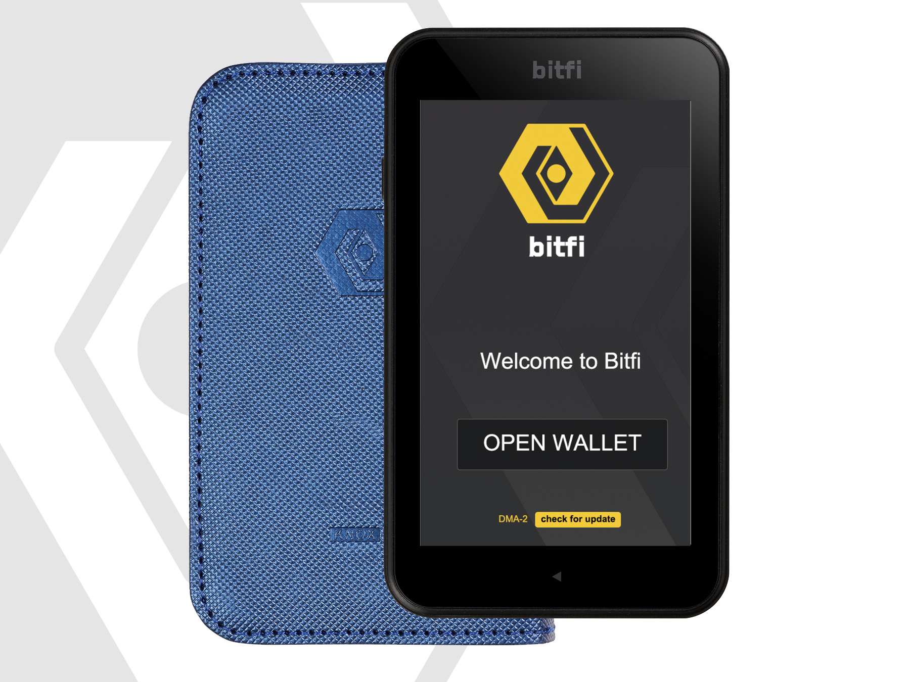
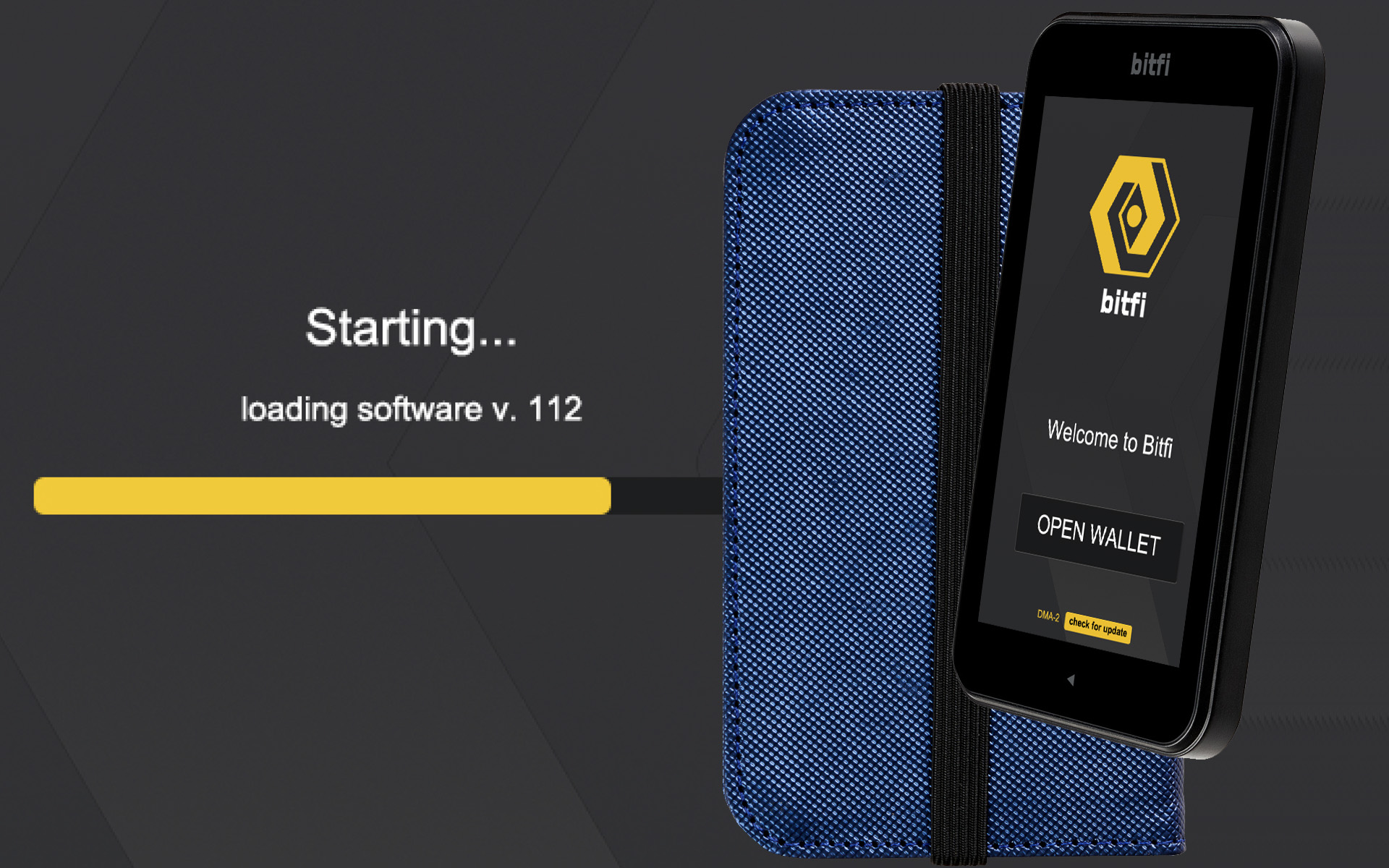
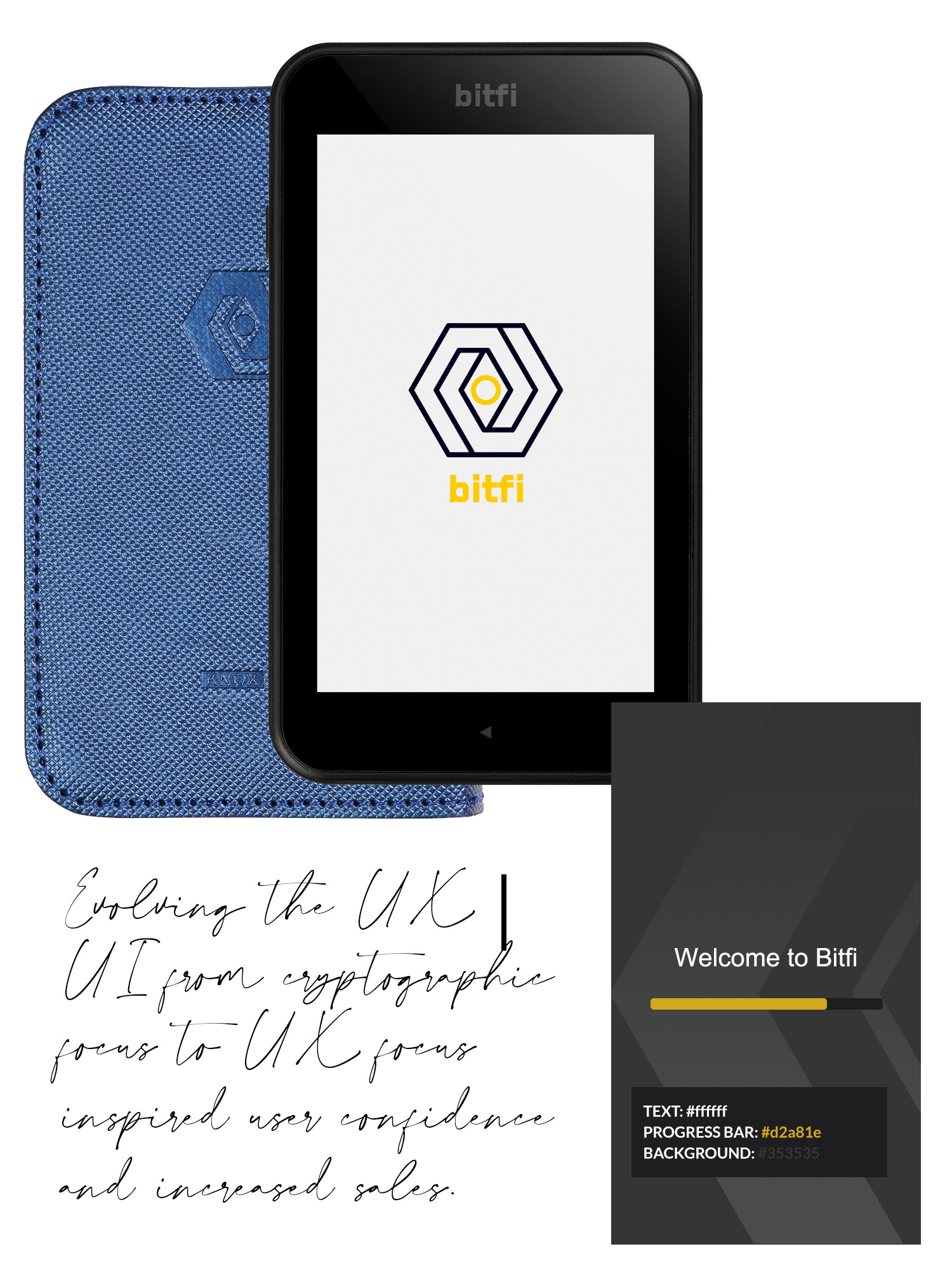
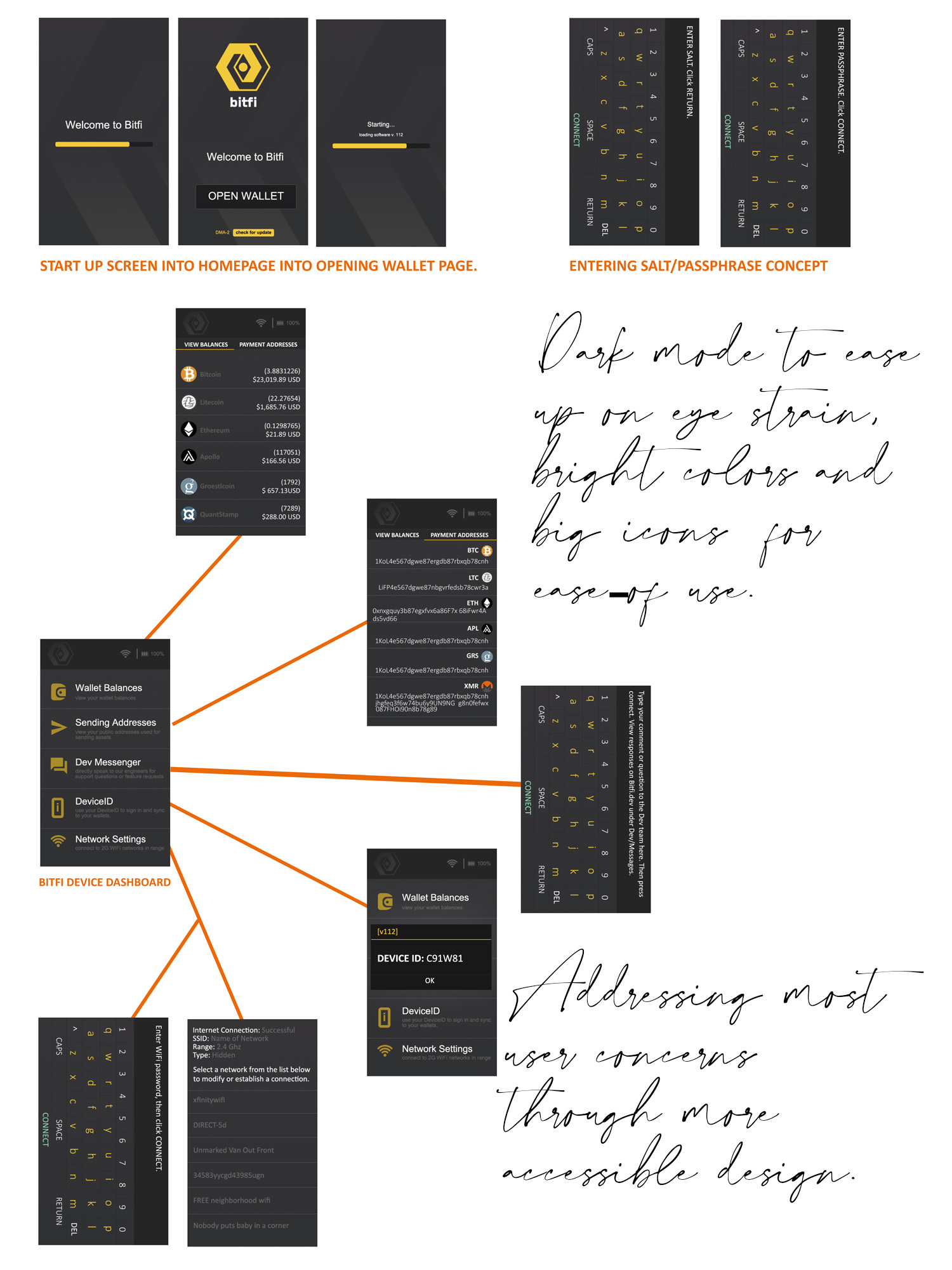
After gathering feedback through months of customer research and communication, a design direction was developed and put into motion. Bitfi soon evolved from the low GUI it launched with into the sophisticated and modern look it retains today.
ROLE: UX | UI | Customer Research
VISIT SITE
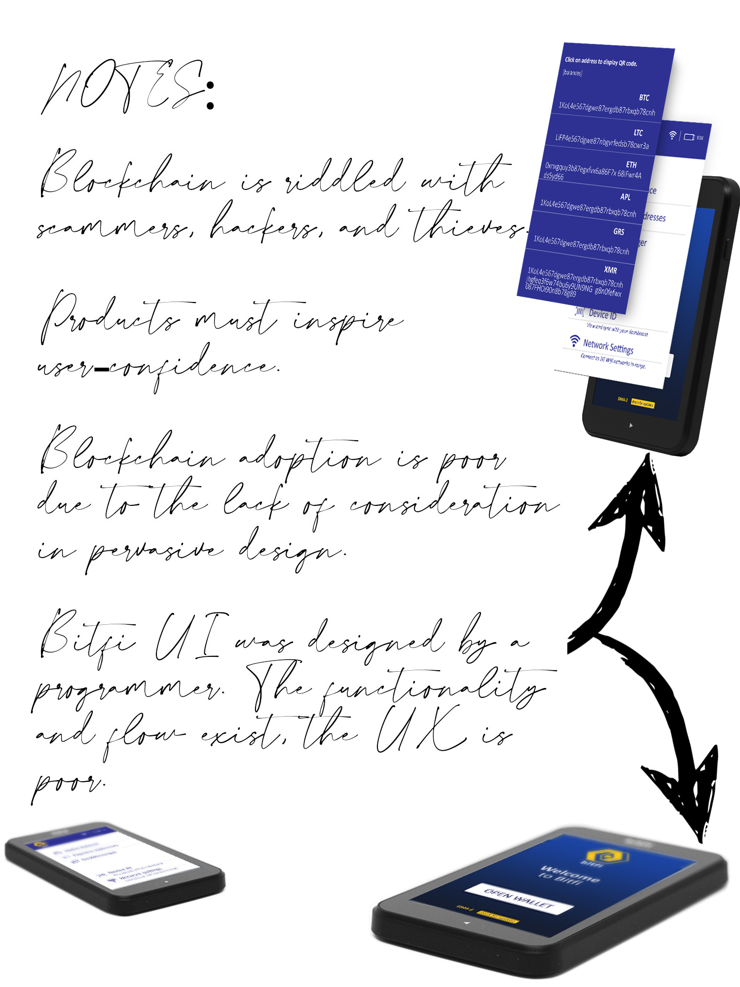

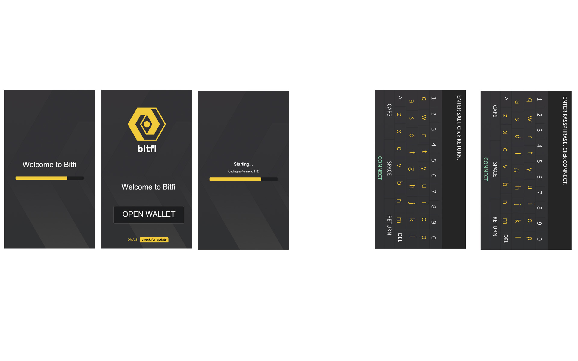
Bitfi had all the makings of a great technological innovation, but it did not inspire user confidence. Although its technology was superior to that of its competitors, its interface looked unfinished, was inconsistent, and concerned users. Users were securing their assets with this device, they weren't sure if it was made by a child or an actual company.
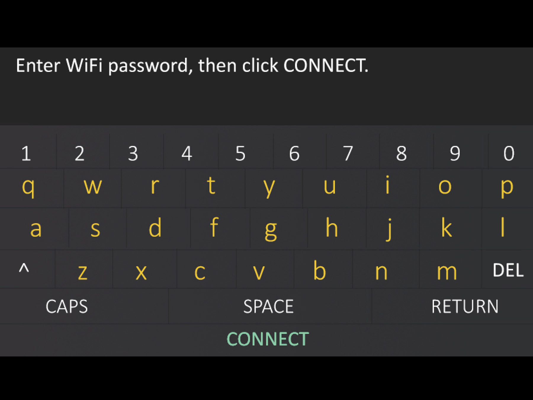
Months of research helped to define the pain points of the users; a cramped keyboard that made it too difficult to type, an unpleasant color scheme, text too small to read, workflow confusing due to the inconsistent nature of each page.
The work to bridge the technical innovation under a single design thread began.
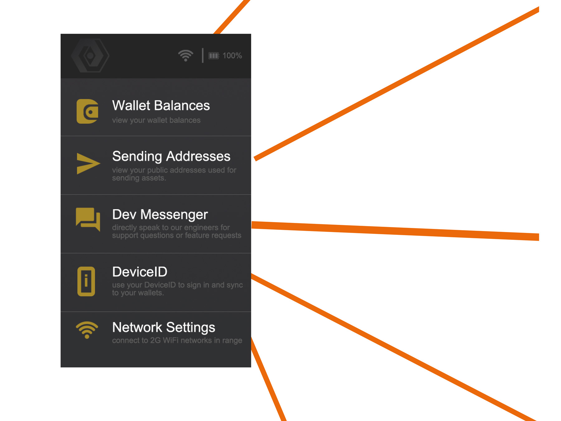
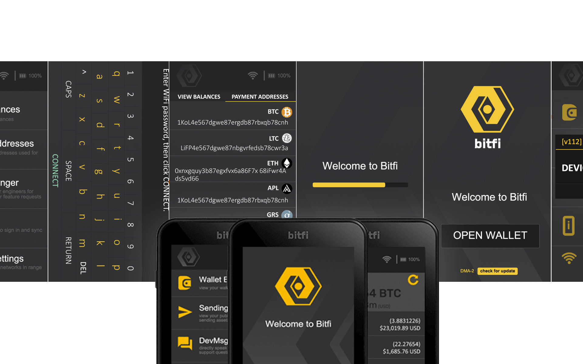
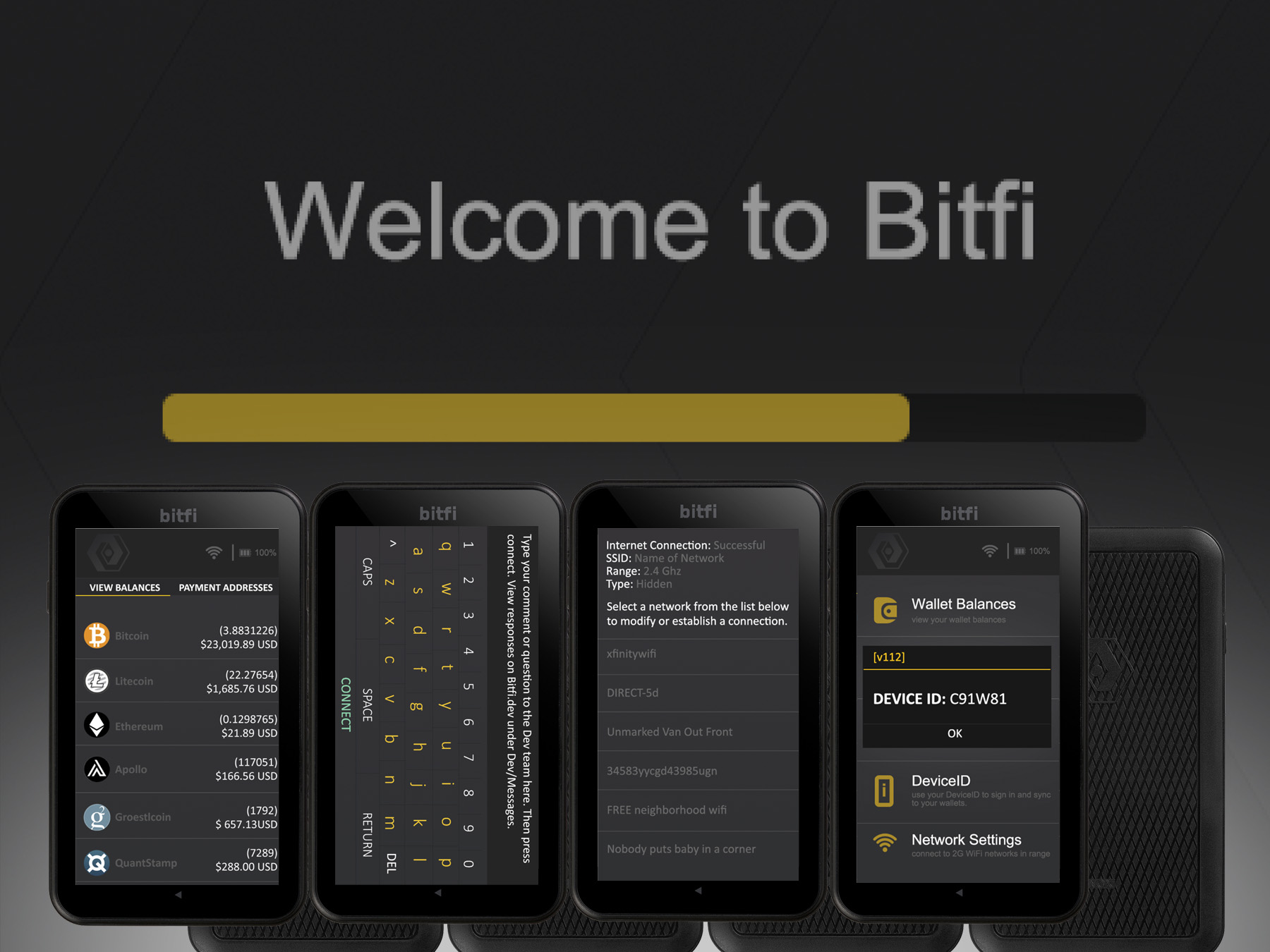
The new dashboard aimed to optimize ease of use while offering maximum functionality. Visual icons as well as text titles for more accessibility, descriptive text for further explaination - reducing the guesswork down to less than a few seconds for the user to begin use.